
<Graphic design>
This page is divided into 2 tabs, the first one breaks down a major project I did in Junior year, making a mock design package around an album. The second tab collects other smaller Adobe Illustration based design projects I did throughout the years.
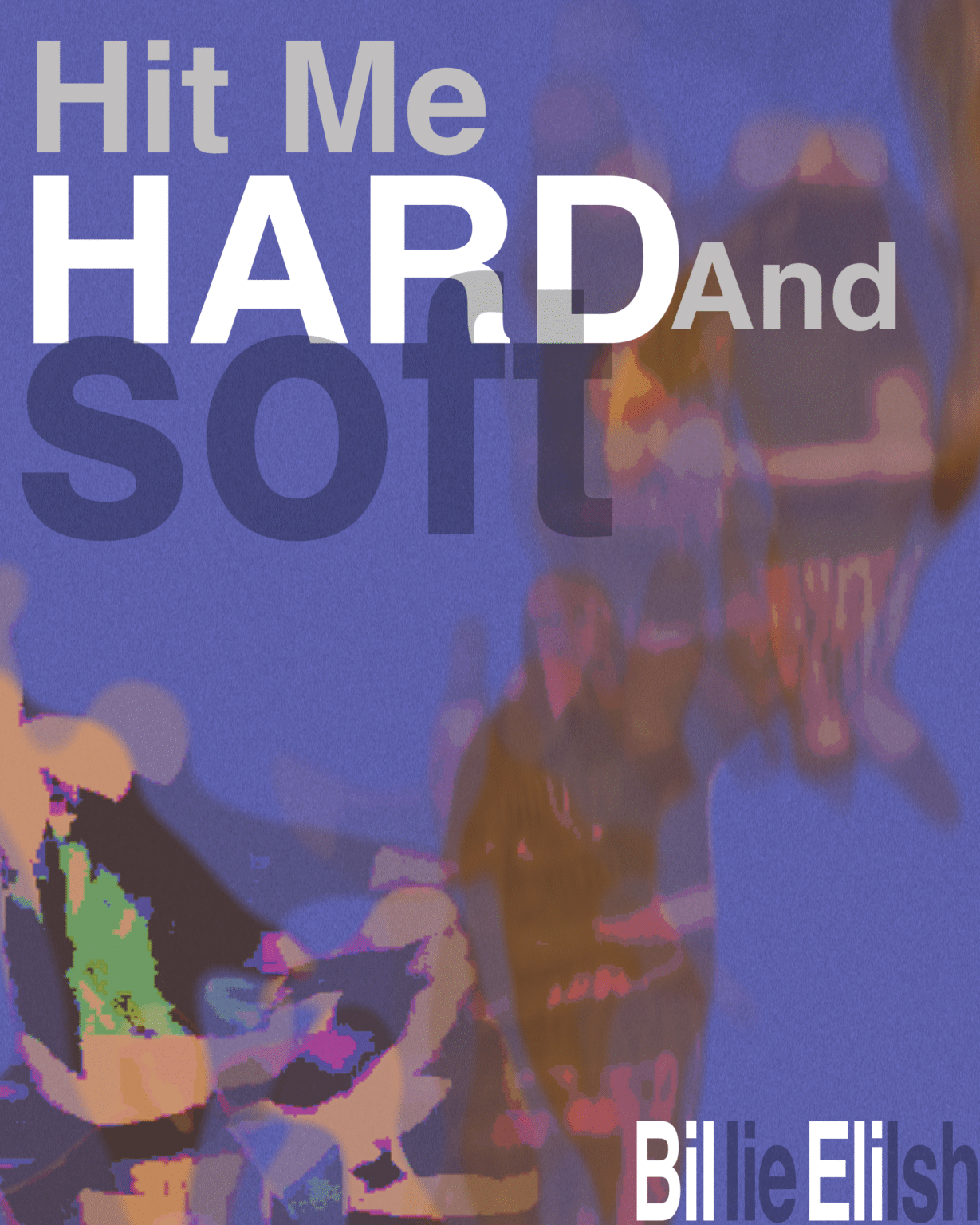
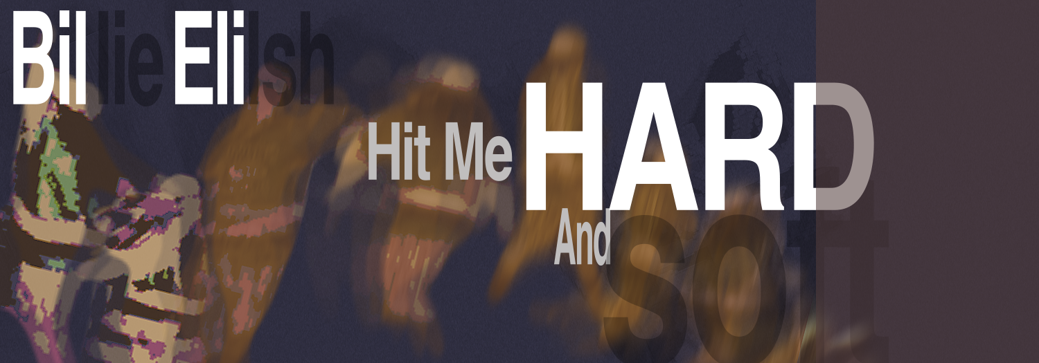
Mock project: Design for HIT ME HARD AND SOFT by Billie Eilish
For this class project, I created a complete design package with a strong visual identity that works across different materials. The goal was to develop a flexible toolkit for designing album art, create a system for making song covers, and design a sound-responsive system that matches the album’s visual style. The goal of this project was to blend consistency with flexibility, making it adaptable for a variety of assets while keeping a unified look.
Album Visual
Read about my design thought process.
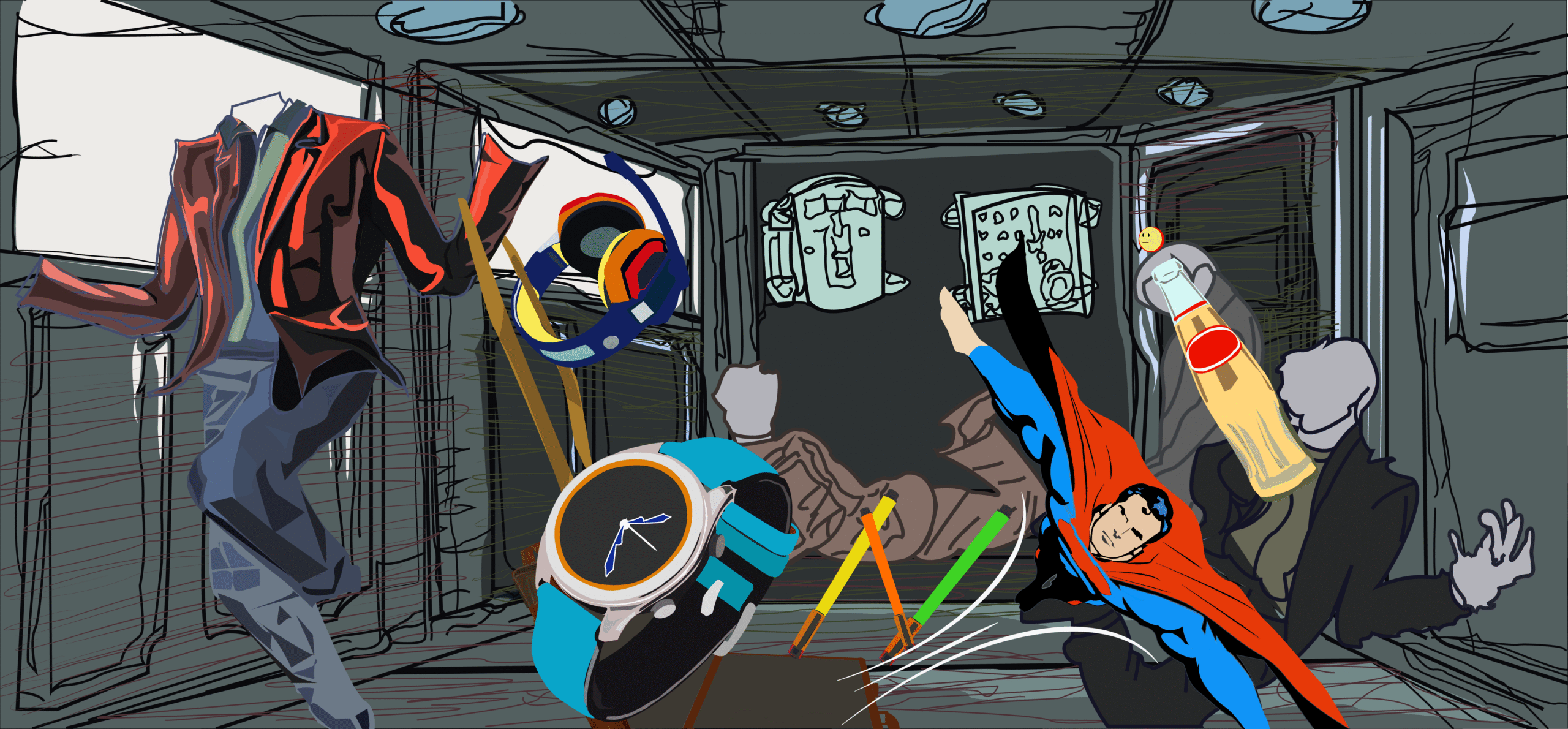
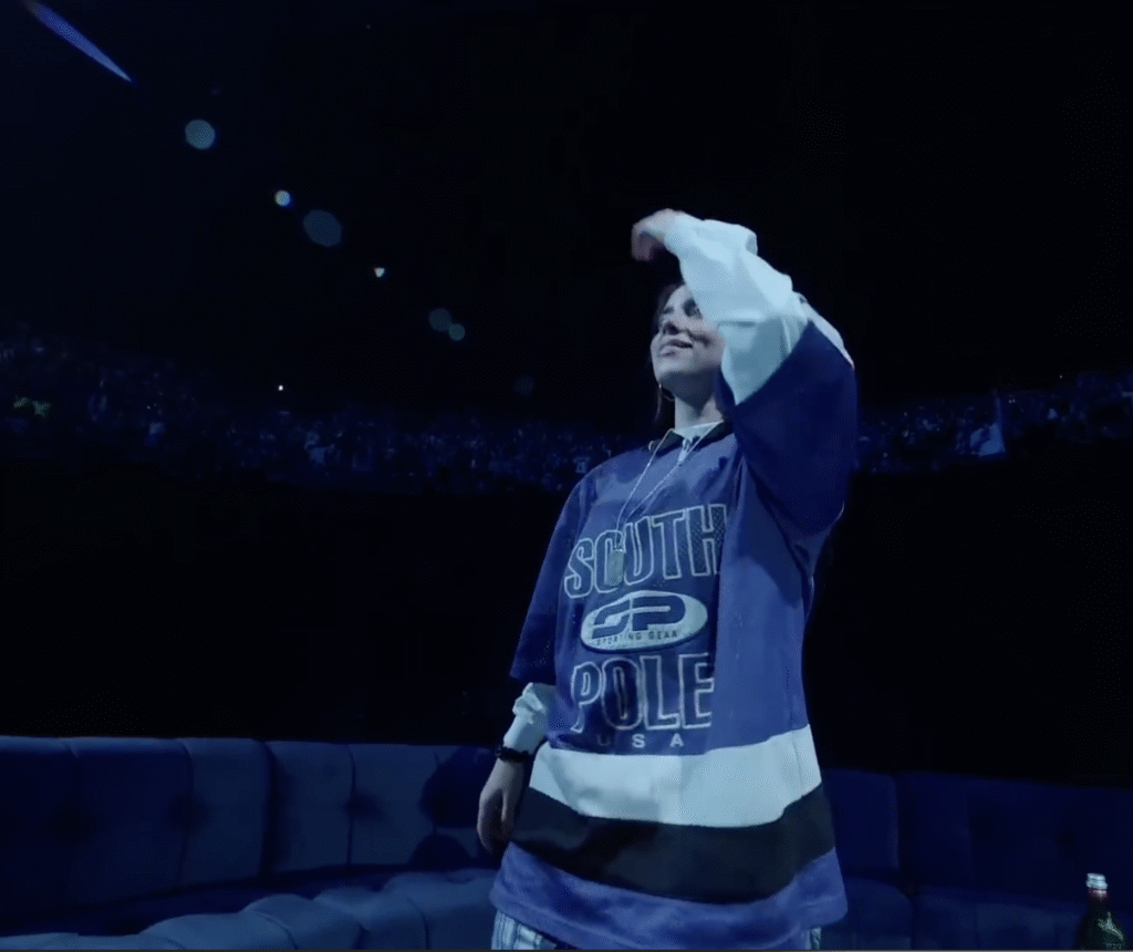
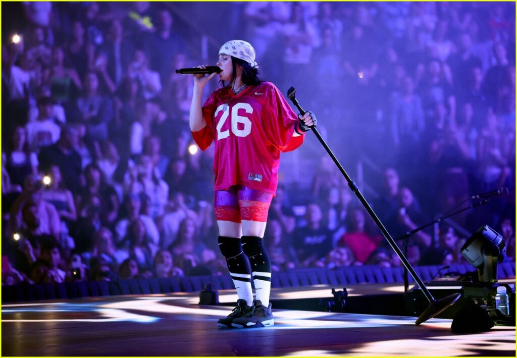
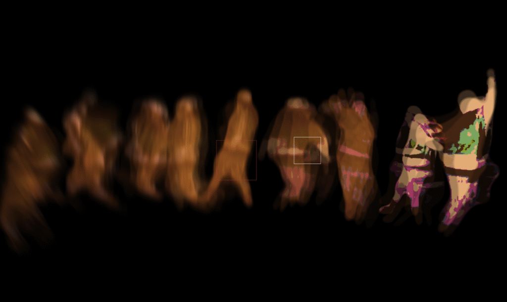
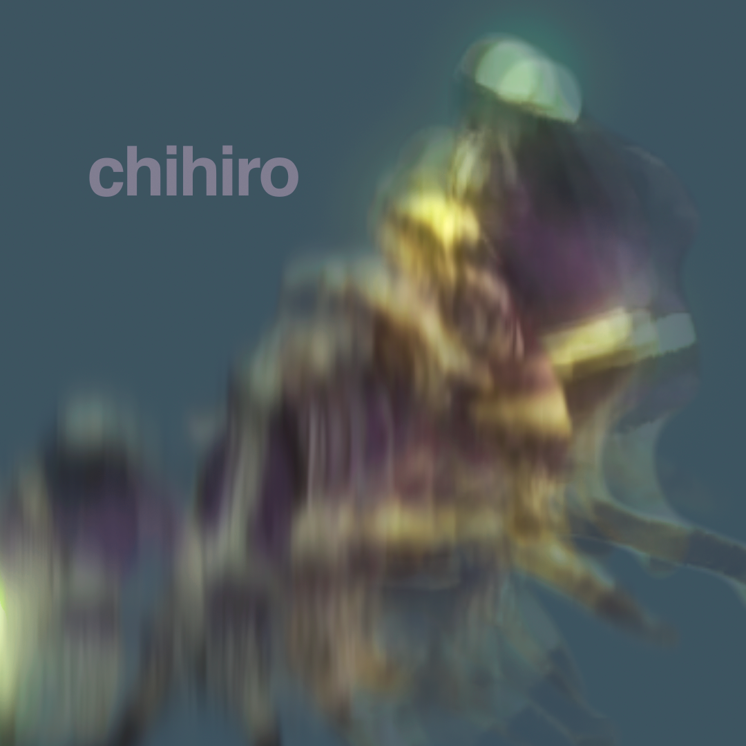
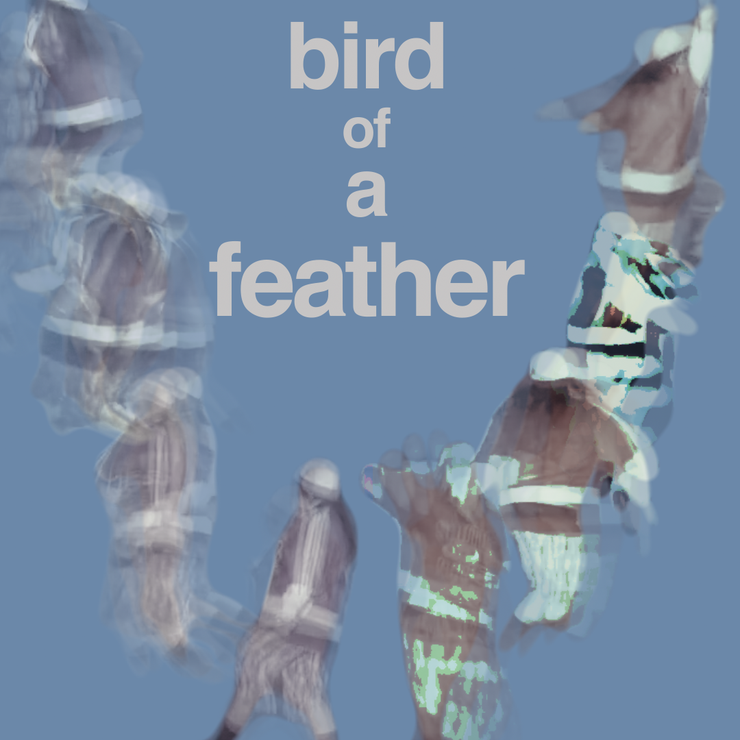
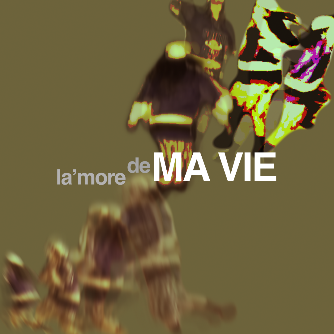
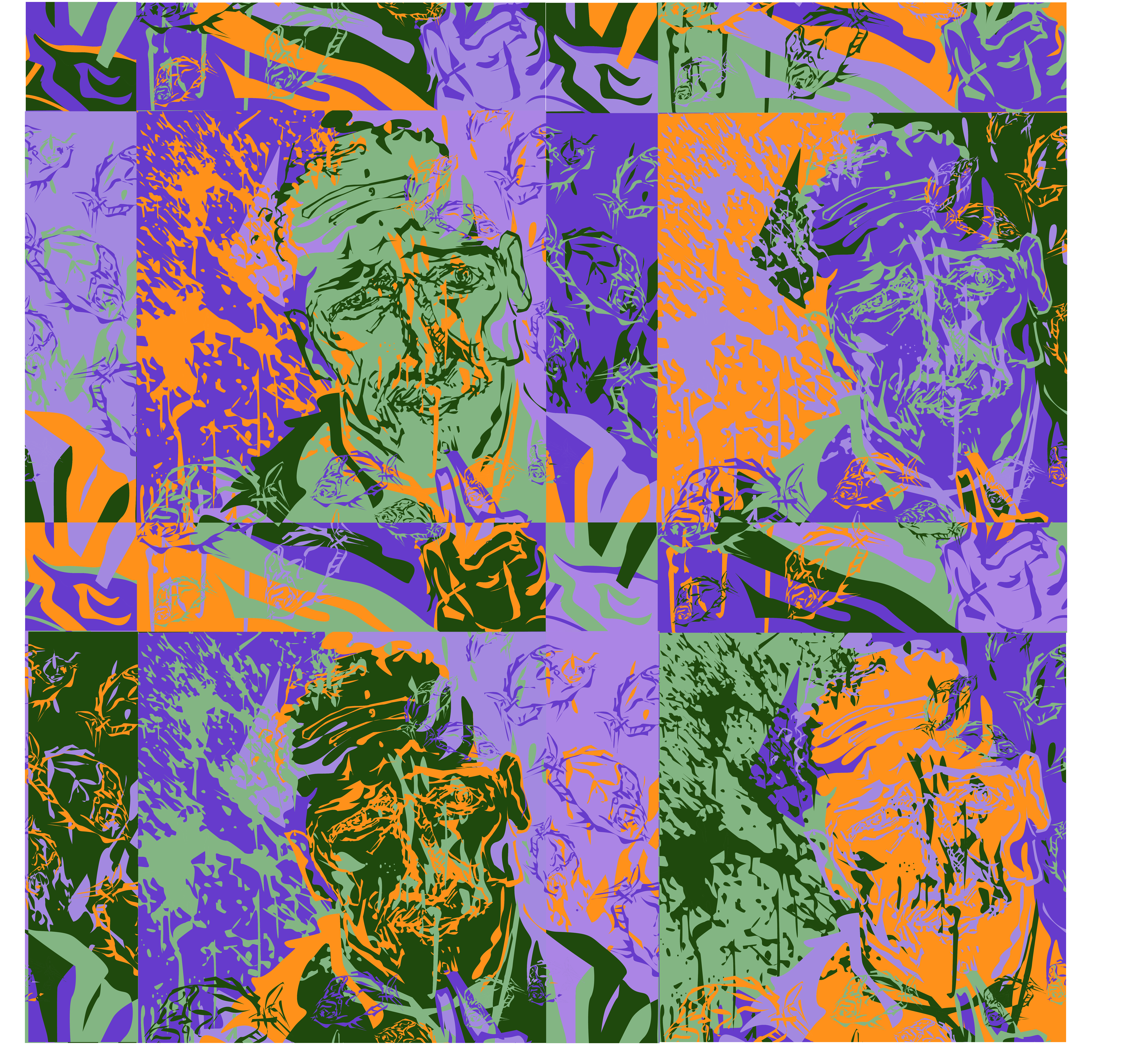
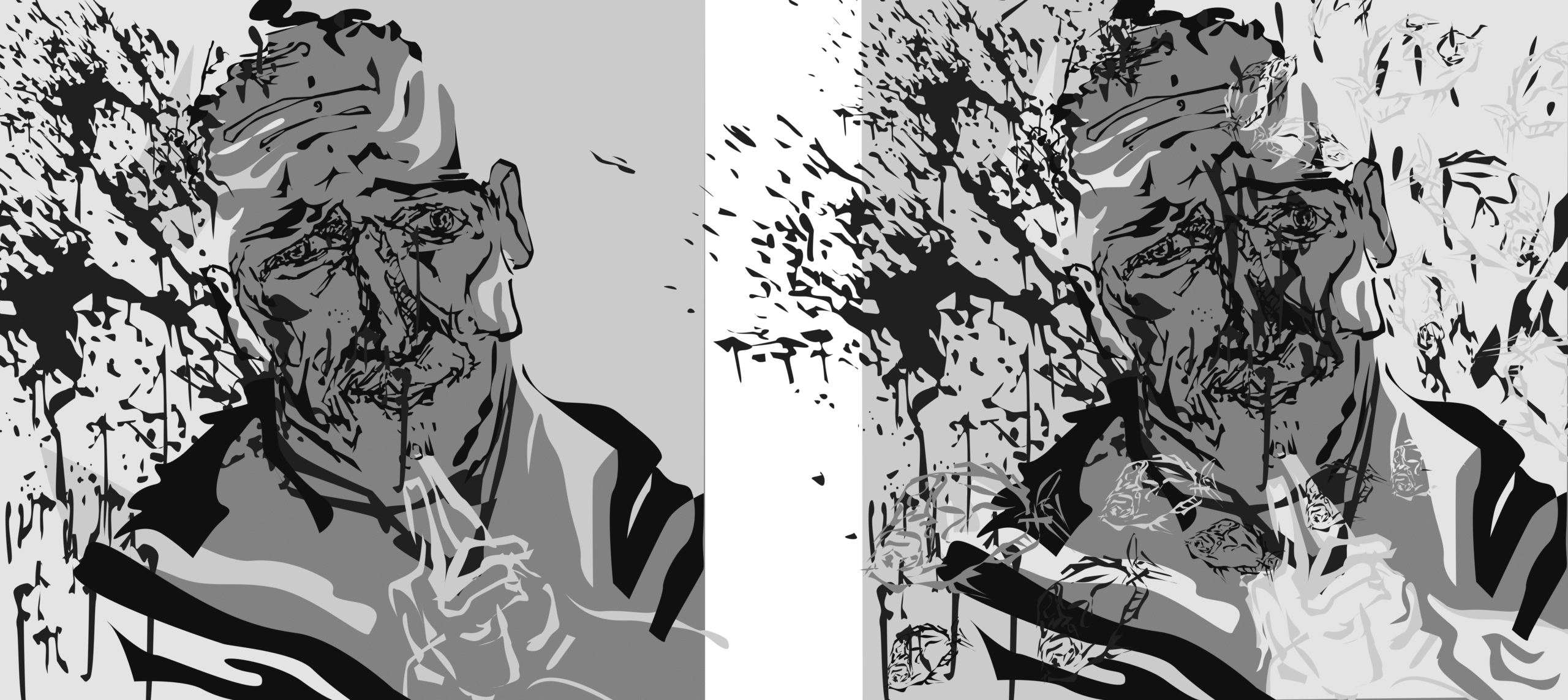
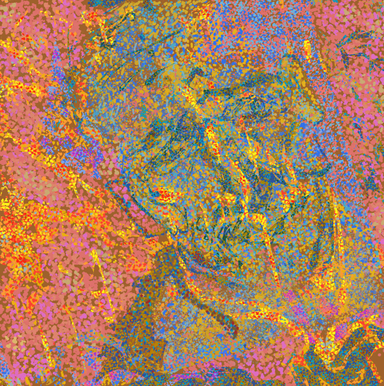
I felt that the album offered a rich variety of moods, with a strong emotional range that moves from “hard” to “soft” (which inspired the album name), providing a diverse listening experience. To translate this into visual design, I decided to use the idea of repetition and the variations within it to reflect the contrasting tones across the album. The concepts of “hard” and “soft” felt like a perfect fit for the design language, so I used those as the key themes to guide my work. After listening to interviews with Billie, where she mentioned that the album isn’t centered around a specific theme but rather reflects her as an artist and the variety of experiences she offers her audience, I decided to base my design around Billie herself. I used her image as the focal point, aiming to illustrate her as an artist through the design choices.
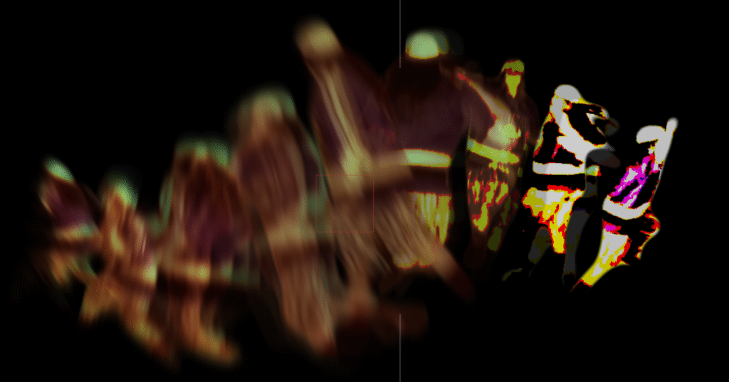
Image treatment test
Video test
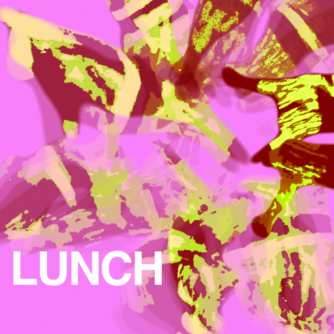
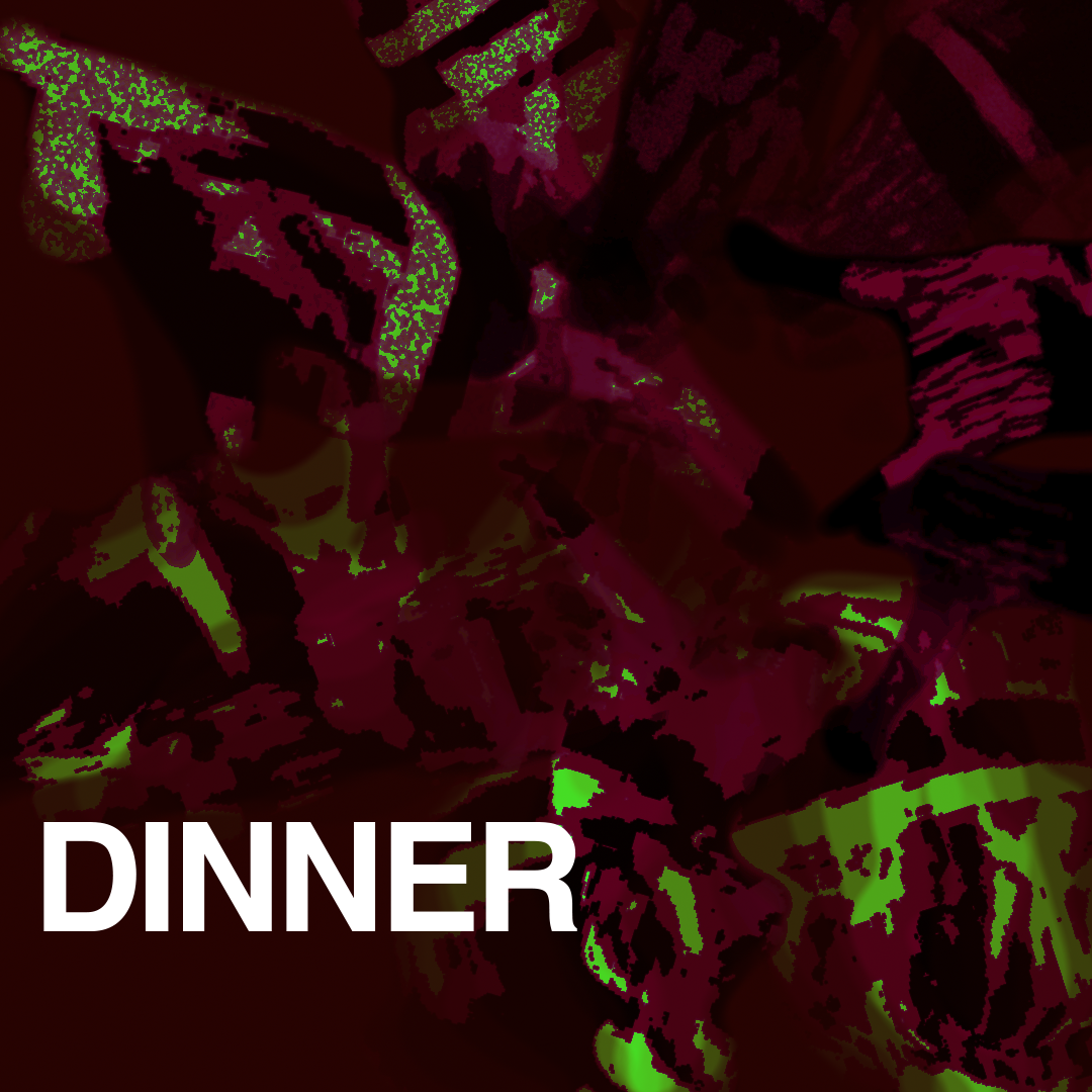
Billie goes from soft to HARD.
soft is defined by fuzzy, blurry, smooth, unsaturated. HARD is defined by chalky, posterized, saturated, contrast.
Album Cover
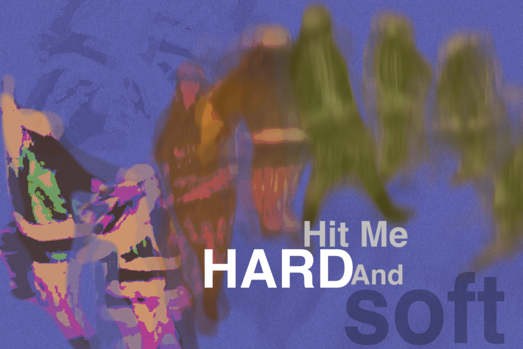
Alternative color
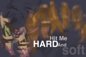
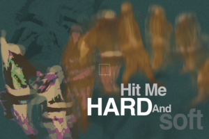
working with moving image
I feel like most album these day are not sold as physical copies, so having a album cover with moving parts seems like a good idea to me.
Toolkit demonstration
Demonstration of the tool kit I made for this project. The core visual asset for this project, can be modify upon changing variables along a slider in After Effect. This allows the asset to be easily manipulated by any user.
Additional asset made with the toolkit
Audio Response system
Since the album is named Hit Me Hard and Soft, each Audio response system is meant to represent a way music can “hit” the audience. The three I choose are:
Television
Retro tv effects such as Glitched frame, Step frames, and Posterize driven by the audio.
Live Stage
Position on Z axis driven by the amplitude, louder closer to the front. The Y position of Bille’s echo is driven by frequency, mimicking the feeling of music filling the room.
CD
The speed of spinning, determine by the syllables in the line.
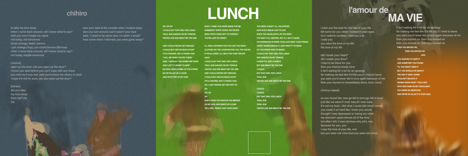
Cover Arts for songs
Soft—————-Hard
Good Mood—————-Bad Mood
Blue—————-Not Blue
Logo, pattern, poster design done with illustrator.
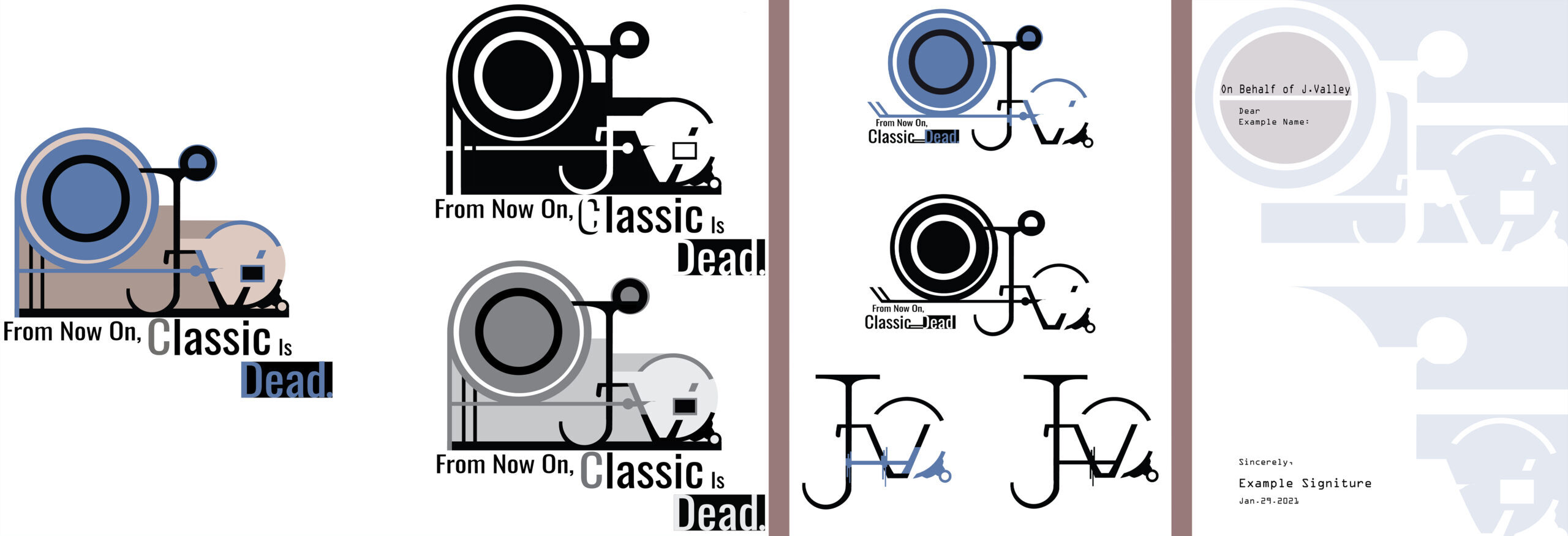
Logo Design: The J.Valley
This is a mockup design for a concept I had. What if there was a museums that only showcase non-traditional art. The museum would focus on innovative practices of art in every culture. It would also features media and genre that’s not usually associated with fine art, such as GIFs, digital arts, comics, etc.
Made with Adobe Illustrator
Pattern Design: Andy
This pattern is inspired by a lovely man named Andy
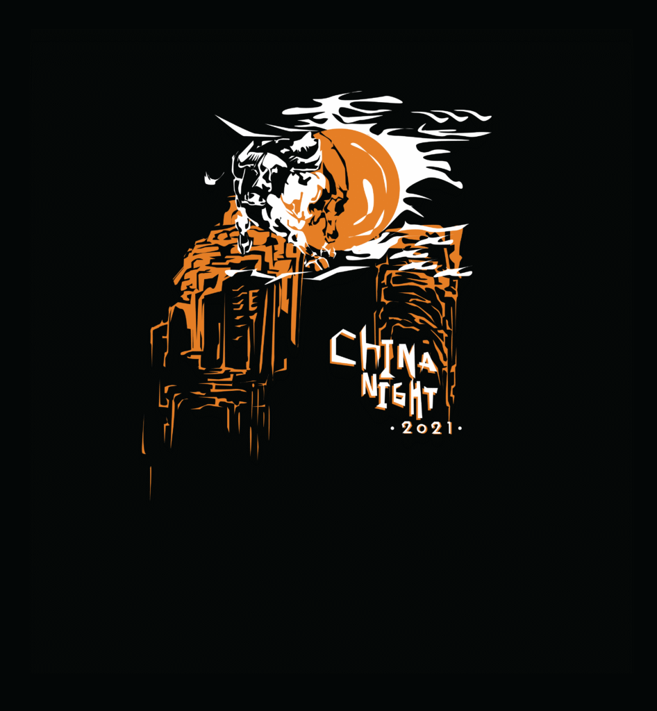
China night
Promotional poster for the event
Design for the event’s merch shirt (Front)
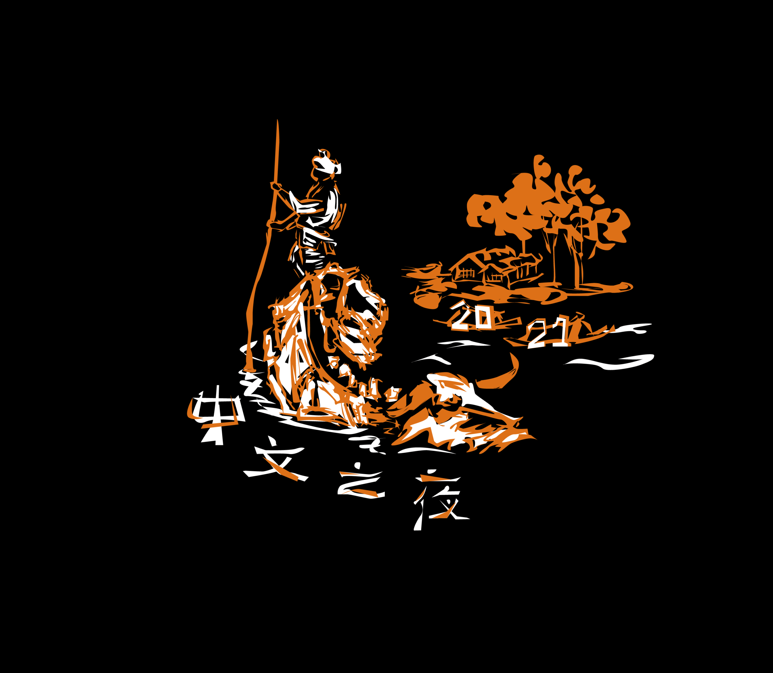
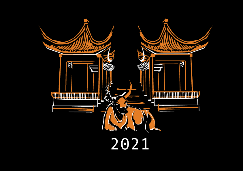
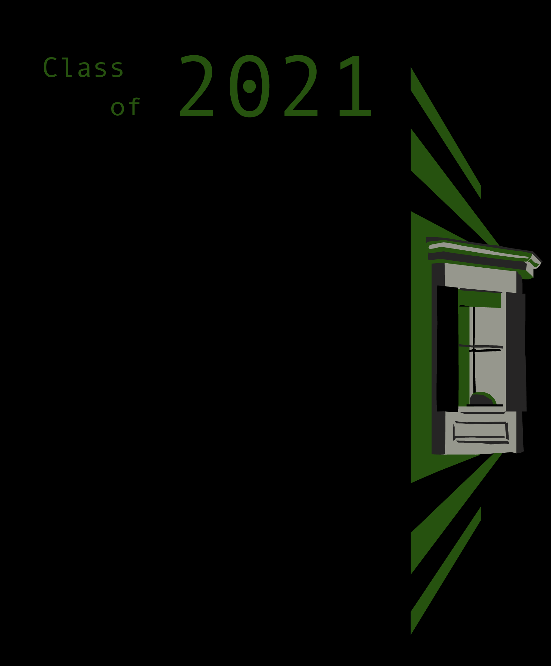
Design for the event’s merch shirt (Back), the second design was used
Shirts for pirates
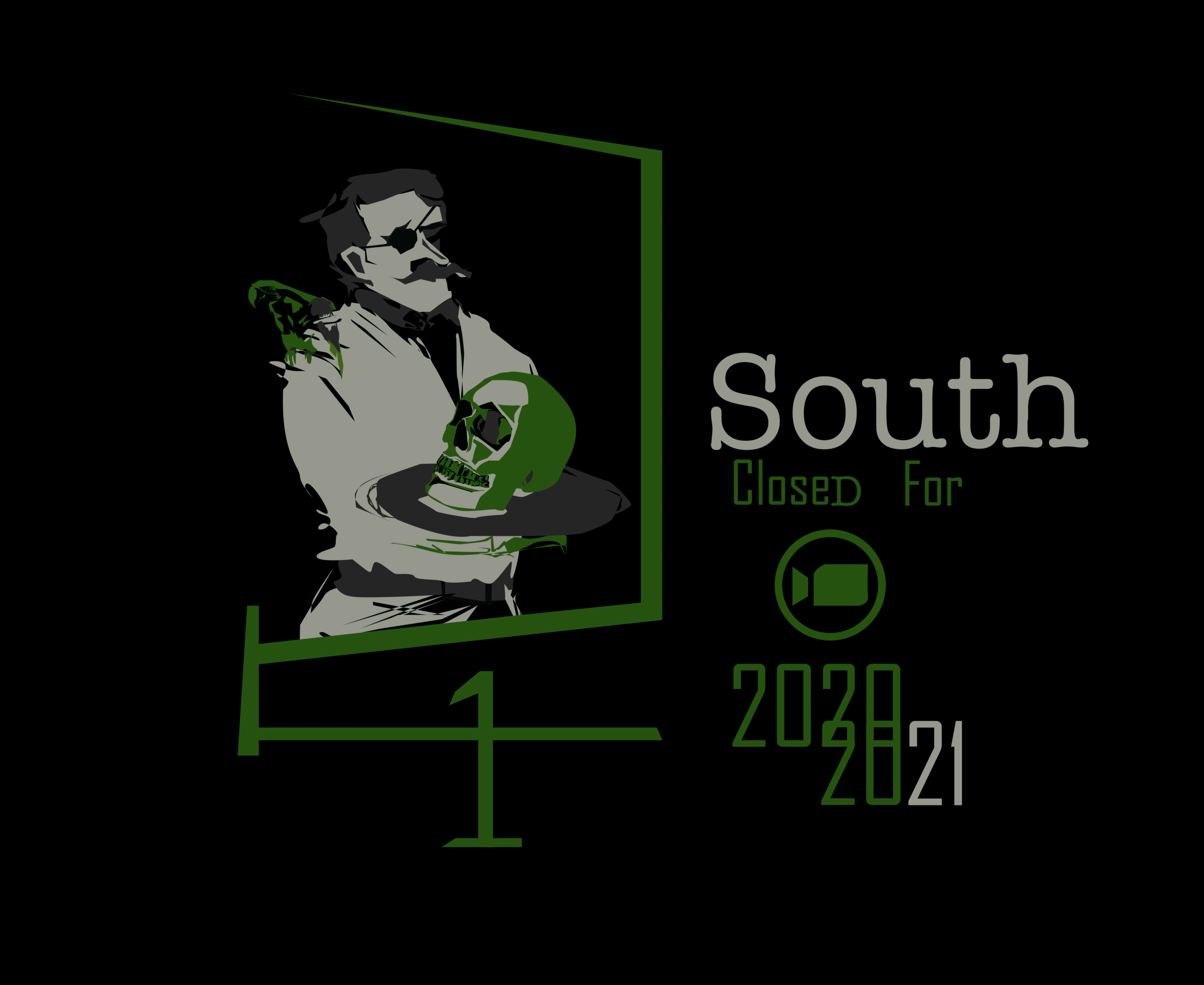
Shirt design (Front)
Shirt design (Back)